ROYAL CASINO NEWS

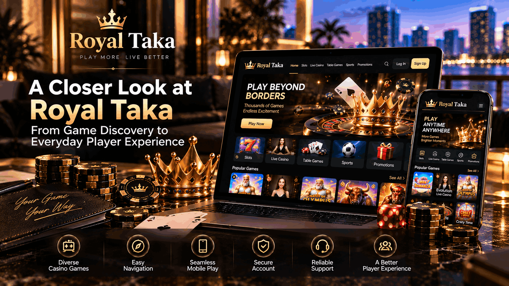
A Closer Look at Royal Taka: From Game Discovery to Everyday Player Experience
Oct 10, 2026
An online casino session usually begins with a small decision.
Maybe a player already knows the game they want. Maybe they have ten minutes and decide to browse. Or perhaps they have returned after a few days and simply want to see what is new.
Those different intentions create very different journeys through the same platform.
At Royal Taka, we think the quality of an online casino is shaped by what happens between the obvious moments. Games are important, of course. But so is reaching those games quickly, understanding where account features live, moving comfortably between devices and knowing where to turn when something does not work as expected.
These details rarely appear in a game screenshot. Players notice them anyway.
The First Few Minutes Set the Tone
People form opinions about digital platforms quickly.
When someone reaches the Royal Taka official website, they should not need instructions just to understand what to do next. The main areas need to feel familiar enough to explore naturally, whether the visitor wants to browse games, access an existing account or learn more about the platform.
This creates an interesting design challenge.
Casino websites contain a lot of information. There may be game categories, promotions, account tools, support access and platform notices competing for attention at the same time.
Putting everything on the first screen does not necessarily make everything easier to find.
In our day-to-day view of platform usability, the better approach is often restraint. Give players enough information to make their next decision, then allow deeper options to appear when they are actually relevant.
A homepage should open the door, not explain the entire building.
Finding a Game Should Not Become a Game Itself
Game libraries have expanded dramatically across the online casino industry.
That creates more choice, but also a practical problem: how do players find something they actually want?
The Royal Taka casino games catalogue needs to work for several types of visitors at once. Some players arrive looking for a familiar title. Others know the category but not the specific game. A third group simply wants to browse until something catches their attention.
Clear categorization helps all three.
Players interested in reels can move toward Royal Taka slot games, while those looking for a more traditional casino format may prefer blackjack, roulette or other table games.
Then there are sessions built around real-time interaction. The Royal Taka live casino offers a different rhythm, where streamed dealer action and familiar table formats create an experience that feels distinct from standard digital games.
The important part is not pushing every player toward the same category. It is shortening the distance between intention and discovery.
Sometimes the Thumbnail Really Does Matter
There is a slightly less serious side to game discovery.
People judge games by their covers.
We can talk about filters, categories and recommendation systems—and those things matter—but visual presentation still plays a surprisingly large role in what somebody chooses to open.
A recognizable theme can attract attention. So can a familiar game mechanic or provider style. Sometimes a player simply likes the look of a title.
That is normal.
Anyone who has spent time looking at user behavior on entertainment platforms will recognize the pattern. People do not always make perfectly structured decisions. They browse, hesitate, change their minds and occasionally click something because the artwork looked interesting.
A useful online casino game selection should leave room for that kind of exploration rather than making every journey feel overly engineered.
Returning Players Want a Different Experience from New Visitors
A new player explores.
A returning player remembers.
That distinction matters more than it initially appears.
Someone visiting for the first time may want to understand categories and platform features. A regular visitor often wants the opposite: fewer decisions between arrival and the content they already know.
This is why familiar navigation becomes valuable over time.
Players should gradually develop a mental map of the Royal Taka gaming platform. They know where their preferred games are located, where account controls appear and how to reach assistance.
When an interface changes, even a seemingly small adjustment can interrupt that familiarity.
Product teams experience this frequently. Moving a button may look cleaner in a redesign, but regular users have already trained their thumbs to look somewhere else.
Sometimes improving an interface means changing it. Sometimes improving it means resisting the temptation to change something that already works.
Mobile Players Bring a Completely Different Context
A desktop user is usually sitting somewhere intentionally.
A mobile user could be almost anywhere.
That difference changes the experience.
Someone using Royal Taka on mobile may be on a sofa with stable Wi-Fi, travelling with cellular data or checking the platform during a short break. Screen size, network quality and available time can all change from one session to the next.
Mobile design therefore has to tolerate uncertainty.
Navigation needs to remain clear on smaller displays. Controls need enough space for comfortable tapping. Games should adapt sensibly to different screen sizes and orientations.
There is also a simple reality that interface prototypes sometimes hide: real people use phones with one hand.
A button placed perfectly according to a design grid may still be awkward to reach with a thumb.
These are the details that make the Royal Taka mobile casino experience feel practical rather than merely compatible.
Moving Between Devices Should Feel Familiar
Players do not necessarily choose one device and stay there forever.
A person may browse on a phone during the afternoon and use a laptop later that evening. What matters is that the platform still feels recognizable.
Categories should use familiar naming. Account areas should not move somewhere completely unexpected. Basic navigation logic should remain consistent.
This does not mean every screen needs to look identical.
Desktop has room for richer navigation and more simultaneous information. Mobile benefits from tighter prioritization. Good responsive design respects those differences while preserving the underlying structure.
The goal is familiarity without forcing every device into the same layout.
That balance is an important part of the broader Royal Taka online casino experience.
Account Management Should Be Quietly Efficient
Most people do not visit an online casino because they are excited about account settings.
That is exactly why those settings need to work well.
The Royal Taka login journey should provide straightforward access while players continue to treat account credentials carefully. Unique passwords and secure devices remain sensible habits for any online account connected to financial activity.
After signing in, the Royal Taka account area becomes the practical side of the platform.
Players may need to review profile information, check account options or locate security-related controls. These tasks are not glamorous, but they become extremely important the moment somebody needs them.
A useful account interface should therefore prioritize clarity over decoration.
There is a good rule for this kind of page: if users barely remember using it because everything was where they expected, it probably did its job.
Support Begins Before Someone Contacts an Agent
One of the more useful lessons from digital customer service is that support does not begin when a conversation starts.
It begins when a problem appears.
If the platform explains common issues clearly, players may solve simple problems themselves. A well-maintained Royal Taka help center can therefore be just as important as direct contact options.
Suppose a game is not loading.
A player might check whether other games open normally, confirm the internet connection and restart the browser. Those simple steps can quickly reveal whether the issue is isolated or more general.
When they do not solve the problem, Royal Taka customer support becomes the next step.
This is where practical information helps.
A support message saying "roulette doesn't work" gives the team relatively little context. Mentioning the device, browser and exact point where the game stopped gives them something concrete to investigate.
Screenshots can help too when an error is visible.
In our experience, useful troubleshooting is often less about asking more questions and more about asking the right question early.
Fast Support Is Good. Useful Support Is Better.
Response time is one of the easiest customer service metrics to measure.
It is not the only one that matters.
A fast response that does not move the issue forward can create another round of messages. A slightly more considered answer that identifies the next useful step may resolve the situation sooner overall.
This is why the Royal Taka support experience should be considered part of the product rather than an isolated service function.
Support teams also see parts of the platform from a perspective that product teams cannot always reproduce.
If several players ask the same question, the issue may not actually be customer knowledge. The interface or explanation may need improvement.
That feedback loop is valuable.
Sometimes the best way to reduce support requests is not to hire more agents. It is to remove the reason people needed to ask the question.
Convenience Should Include Player Control
The online gaming industry talks frequently about convenience.
Faster access. Easier navigation. More games. Better mobile experiences.
There is another part of convenience that deserves equal attention: control.
Casino gaming involves financial risk and uncertain outcomes. Players should decide what level of spending and time fits their own entertainment budget rather than treating gaming as a way to generate guaranteed income.
Available responsible gaming tools can support those decisions.
The fact that mobile platforms are accessible almost anywhere makes this particularly relevant. A phone removes many natural stopping points that exist with other forms of entertainment.
A player-focused platform should therefore make entertainment accessible while also making personal limits understandable.
Those two ideas are not in conflict.
The Future Experience May Actually Look Simpler
Online casinos will continue becoming more technically capable.
Devices are getting faster. Connections are improving. Games are becoming richer, and personalization technologies can help platforms understand what content is relevant to different users.
The temptation will be to show more.
The better experience may be to show less.
If a player already knows what they want, the platform should shorten the route. If they want to explore, discovery tools should help without becoming overwhelming. When something goes wrong, support should be visible without constantly occupying the interface.
That is the direction we find interesting when thinking about the Royal Taka player experience.
The next generation of casino platforms may not be defined by how many features they can place on a screen. It may be defined by how confidently they know which features can stay out of the way.
Players are usually the best judges of that balance.
When you use an online casino regularly, which detail matters more over time: finding games faster, keeping the interface familiar, having a better mobile experience, or getting useful support when you actually need it?
We would like to hear what you notice. The smallest frustrations—and the small conveniences people quickly begin taking for granted—often reveal where the next meaningful improvement should happen.